
compose-popupbar: a popup player bar for Jetpack Compose
Apple Music is the reference for the mini player in Swift Radio: tap the bar or drag it up and it grows into the full player. Drag down and it shrinks back. On iOS, LNPopupController handles that interaction in Swift Radio.
When I ported the app to Android, I used a mini player over a Material bottom sheet. Tapping the bar opened the sheet, but dragging the sheet left the bar sitting underneath it. The two components worked independently.
I wanted the bar to become the player. That's what compose-popupbar does. It's MIT licensed. Version 0.2.0 adds backgrounds that grow with the bar into the full player, and ships in Swift Radio Android 1.2.1.
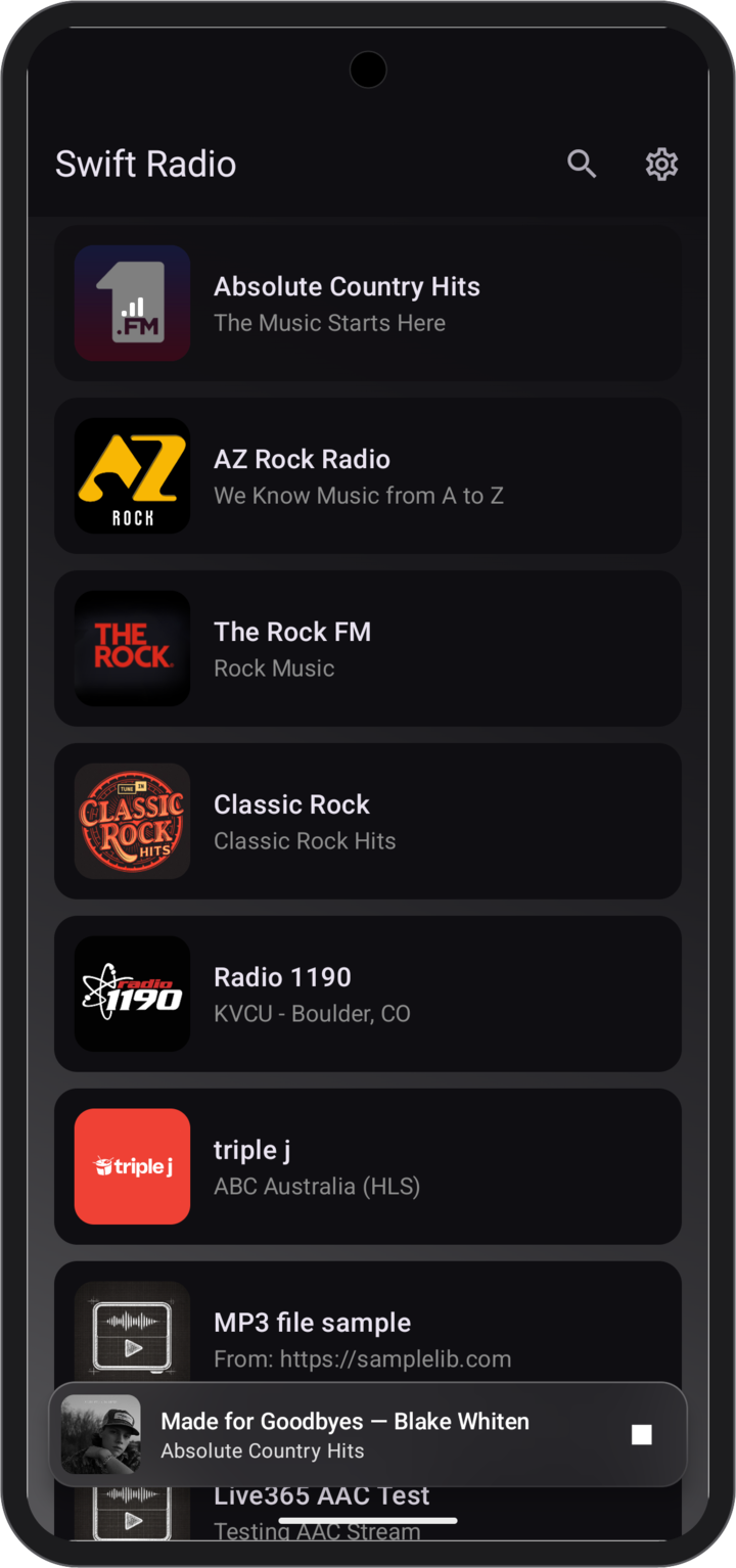
Swift Radio 1.2.1: glass over the station list.
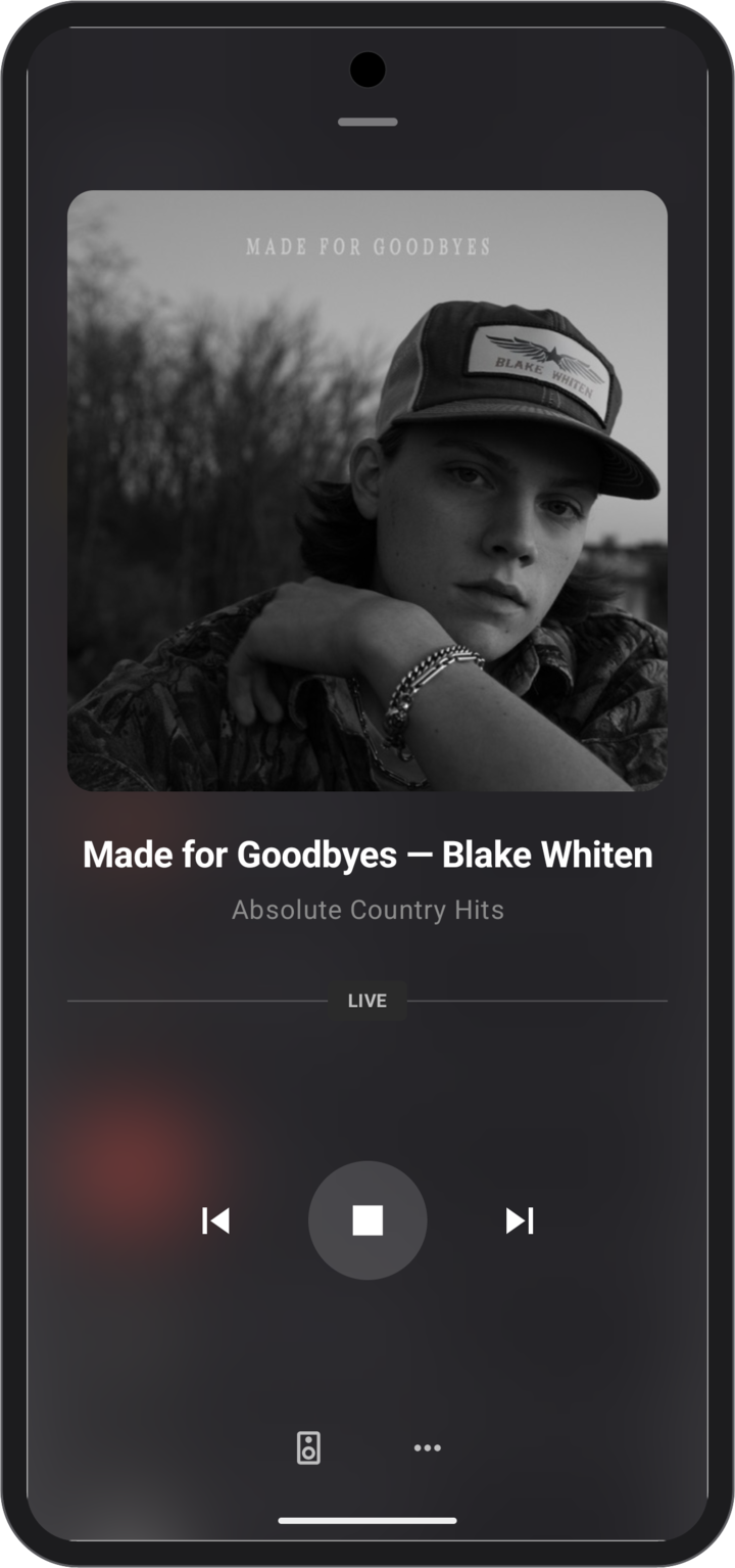
Expanded: the same glass behind the full player.
What it does
The library handles presentation and gestures; the app supplies the content. Pass it a bar, a full-screen composable, and optionally the artwork to share between them.
- Dragging: the bar and the full-screen content follow your finger. You can stop or reverse the transition halfway through. Predictive back closes the player too.
- Shared artwork: one composable travels between the bar thumbnail and the expanded slot, so the cover grows instead of cross-fading.
- Seeking: an optional progress strip along the bar's edge supports drag-to-seek when you pass a seek callback.
- Accessibility and RTL: the bar is one merged node, content behind the expanded popup is hidden from TalkBack, close controls are localized, and the layout mirrors.
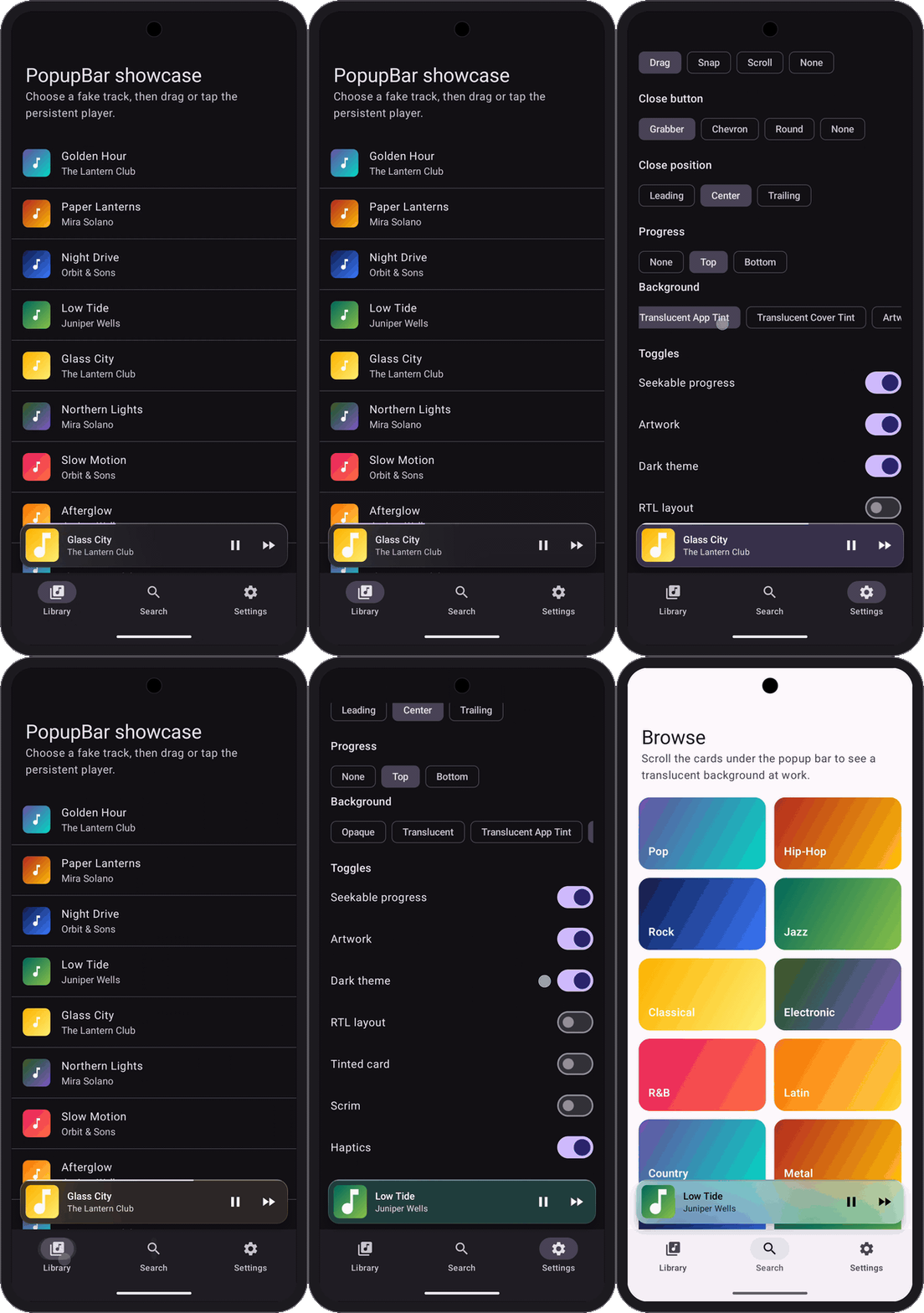
The 0.2.0 sample: gestures, glass, and artwork backgrounds in dark and light mode.
Bar styles
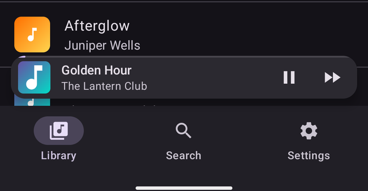
There are four styles: floating, floating compact, prominent, and compact. Choose one with a parameter on PopupHost. They all sit above the bottom navigation and use the same transitions and gestures. The screenshots below show the dark theme.
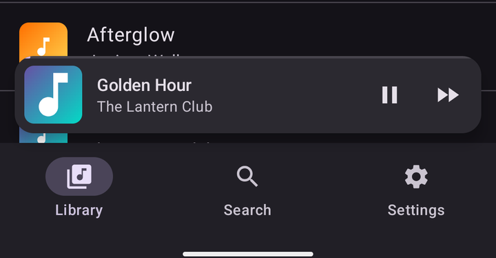
Floating, the default.
Floating compact.
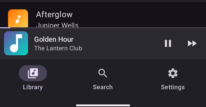
Prominent.
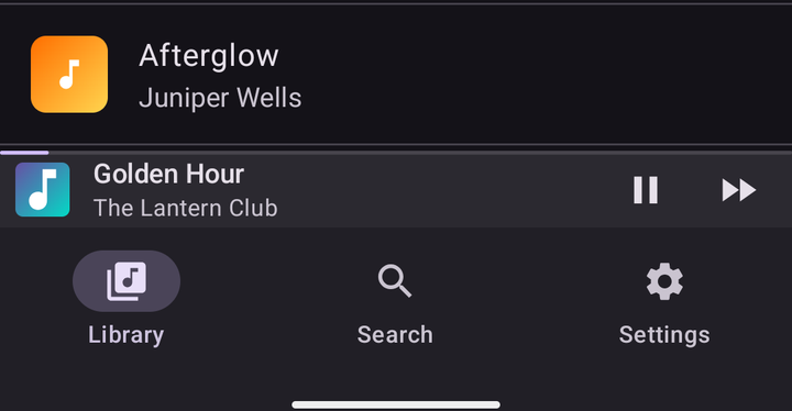
Compact.
Glass and artwork backgrounds
The original bar used a solid surface. In 0.2.0, PopupHost has a background parameter that controls the surface behind both the bar and the expanded player. PopupBackground.Opaque is still the default.
- Translucent glass:
PopupBackground.Translucent()blurs the app content underneath. Pass atint, such as the theme's primary color or a color from the current cover, to color the glass. - Artwork:
PopupBackground.Artwork()uses the host'spopupImageas a blurred backdrop. Its colors drift slowly while the player is open. Setanimated = falseto keep it still.
Both follow the theme by default. Keep the expanded content's background transparent so it doesn't cover the effect, and use LocalContentColor for text that should follow the backdrop. The artwork option also accepts a scrim and blurRadius; a black scrim keeps the player dark in either theme.
Real blur needs Android 12 (API 31) or newer. On older devices, translucent glass uses a tinted overlay and artwork falls back to the plain card. Artwork also falls back when no popupImage is supplied. The library itself still supports Android 7.0 and up.
Using it
Add JitPack to your repositories, then add the dependency:
// settings.gradle.kts
dependencyResolutionManagement {
    repositories {
        maven("https://jitpack.io")
    }
}

// build.gradle.kts
dependencies {
    implementation("com.github.fethica:compose-popupbar:0.2.0")
}
PopupHost wraps your screen. It takes the bottom bar, the popup bar, and the expanded content, then provides bottom padding so lists can scroll out from under the bar.
@Composable
fun PlayerScreen() {
    val popupState = rememberPopupState(PopupValue.Collapsed)

    PopupHost(
        state = popupState,
        background = PopupBackground.Translucent(
            tint = MaterialTheme.colorScheme.primary,
        ),
        bottomBar = { NavigationBar { /* items */ } },
        popupBar = {
            PopupBar(title = "Title", subtitle = "Subtitle")
        },
        popupContent = {
            Box(Modifier.fillMaxSize()) {
                // Full-screen player content
            }
        },
    ) { padding ->
        LazyColumn(
            contentPadding = PaddingValues(bottom = padding.calculateBottomPadding()),
        ) {
            // App screen content
        }
    }
}
The bar expands on tap. Call the state methods from your own UI or app state to present, expand, collapse, or hide it. For the artwork backdrop, replace the background value with PopupBackground.Artwork() and supply your cover composable through popupImage. The option matrix, insets, shared artwork, and the composite-build setup are in the 0.2.0 documentation.
Existing calls using named arguments or a trailing content lambda keep working with 0.2.0. If you passed the final content lambda positionally inside the parentheses, name it content = { ... } because the new background parameter comes before it. Rebuild against the new dependency when upgrading.
The 0.2.0 release also includes a signed sample APK for trying the styles and backgrounds on a phone.
Artwork and padding
The artwork looked fine in the bar but blurry in the player. Coil sized its image request from the first measurement it saw: the 48 dp thumbnail. When the same composable expanded, it stretched that small image to fill the player.
Requesting the image at its original size fixed it. The expanded size also works, as long as the request is large enough for the player. The bar can downscale from either.
With the artwork background enabled, popupImage is composed twice more for the blurred layers. Keep that composable focused on drawing the cover; each copy has its own state and effects.
Padding caused a separate problem. PopupHost provides bottom padding for the navigation bar, the popup bar, and its margins. A screen inside a Scaffold can add navigation-bar padding again, leaving an extra band of background under the floating bar.
Disable the scaffold's bottom inset and apply the host's padding as contentPadding on the list. That leaves the list visible behind the floating bar while letting the last item scroll above it.
In Swift Radio Android
The port removed more code than it added. The MiniPlayer composable and the BottomSheetScaffold around the station list are gone. One PopupHost owns the bar and the player, the station list takes its bottom padding from the host, and the artwork travels from the bar into the player.
In Swift Radio Android 1.2.1, I use the new glass background tinted from the current artwork. AndroidX Palette extracts the color from Coil's cached image. The previous tint stays while the next cover loads, so switching stations doesn't flash the glass back to an untinted surface.
The background, bar style, and progress strip now live in Config.kt:
val popupBarStyle = PopupBarStyle.Floating
val popupProgressStyle = PopupProgressStyle.Top
val popupBackground = PopupBackgroundOption.TranslucentCoverTint
PopupBackgroundOption is Swift Radio's config enum. It offers Opaque, Translucent, TranslucentAppTint, TranslucentCoverTint, and Artwork, then maps the choice to the library's PopupBackground. Switch to Artwork for a backdrop made from the cover itself, or Opaque for the original solid card.
If you run a fork, pull the v1.2.1 tag and rebuild. A customized Config.kt needs those three settings merged in. Your stations.json and theme stay as they were.
Not yet
I'd still like to add paging: swiping the bar to the previous or next item.
The release has the full changelog. If you're building a player in Compose and the bar doesn't fit your case, open an issue or write to me. I'd like to hear what's missing.